Gen Z
WEBSITE
2021
the Challenge
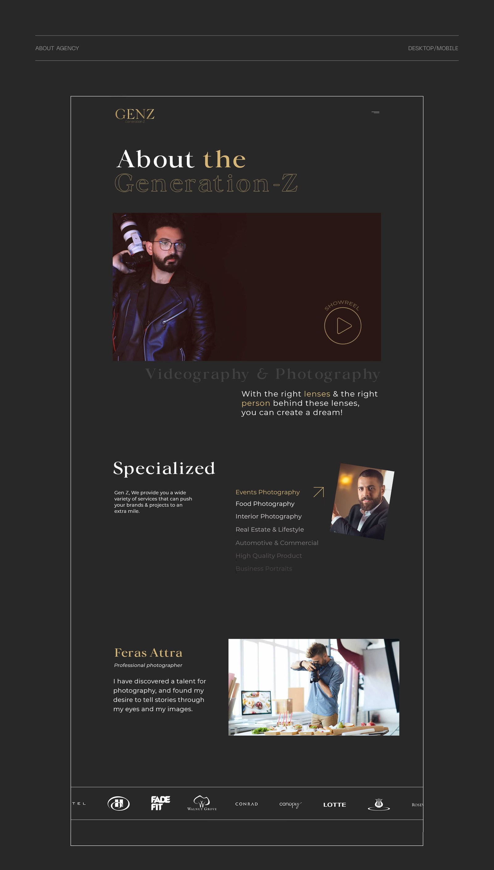
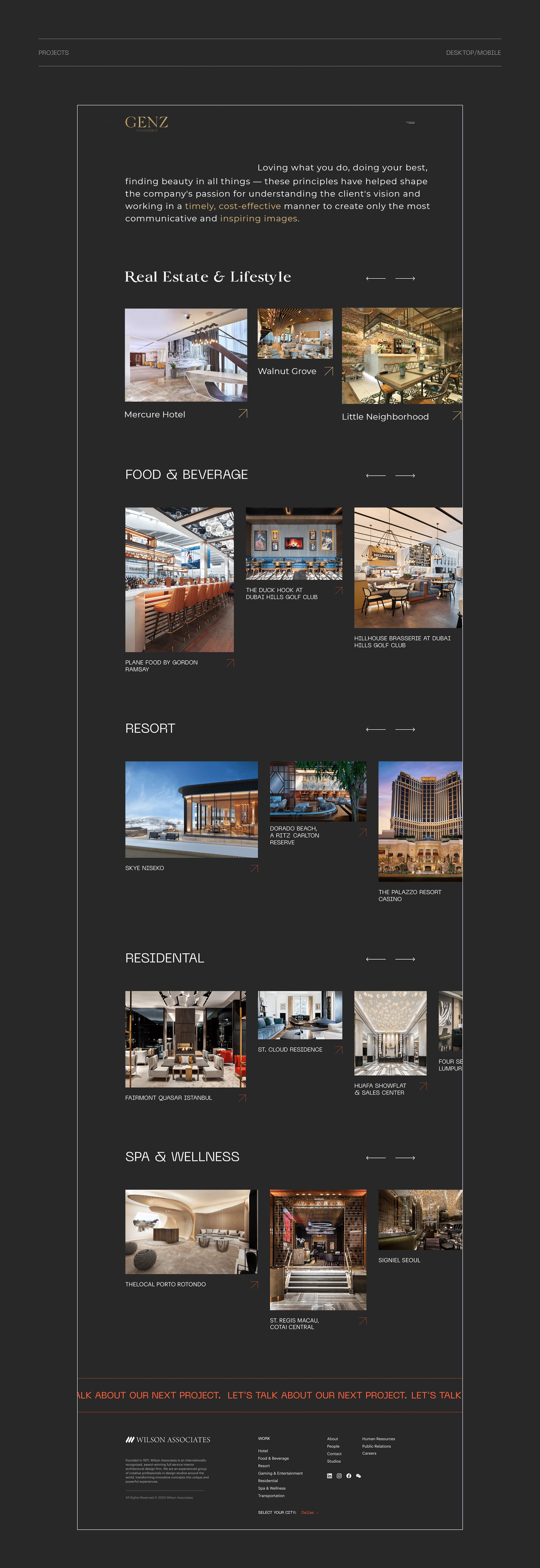
The main feature of the website is its immediacy in the use of the photographer's works by focusing on the minimal aspect in terms of structure and layout but at the same time enhancing the photos. The design needed to be as elegant and clean as possible. I chose a serif font that felt like one you’d see in a fashion newspaper, and plenty of negative space ensures that the pictures do not fight with each other for attention.


Consider me as a part of your team. A new and challenging project? Bring it on! functionality + creativity. 99.99% effective SEO.
Consider me as a part of your team. A new and challenging project? Bring it on! functionality + creativity. 99.99% effective SEO.
functionality + creativity.
functionality + creativity.
functionality + creativity.
DID WE JUST BECOME BEST FRIENDS?
DID WE JUST BECOME BEST FRIENDS?
DID WE JUST BECOME BEST FRIENDS?
